

The gaming world moves fast, but sometimes, the most significant shifts are hiding in plain sight. In an era dominated by whispers of the metaverse and AI companions, a quiet but powerful revolution is taking place within the halls of Microsoft. It started with a vote. In early 2026, newly appointed Xbox CEO Asha Sharma took to social media to ask the community a seemingly simple question: “Xbox,” or “XBOX”? The response was overwhelming, with the capitalized, bold version of the name winning by a landslide. This was the first public hint of a seismic shift brewing within the brand.
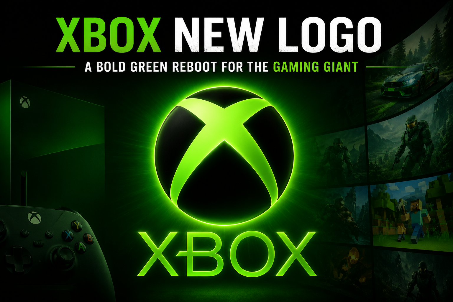
Days later, the transformation became official. Microsoft Gaming, the corporate moniker that had defined the division for years, was being retired. In its place, the phoenix was rising again: Xbox was back, and it was bringing a familiar, vibrant green glow with it. This wasn’t just a cosmetic update; it was a mission statement in visual form. The xbox new logo, a gleaming, three-dimensional evolution of the iconic “X,” marks a return to the brand’s roots and a decisive break from the recent past. It signals a new era, one that feels less like a faceless tech giant and more like a passionate member of the gaming community it serves.
The End of an Era: Saying Goodbye to “Microsoft Gaming”
For a long time, the brand’s identity was split. The products were Xbox, but the corporate structure was Microsoft Gaming. This distinction, often only visible to insiders, created a subtle disconnect. It made the brand feel more like a division of a conglomerate than a dedicated gaming platform. New CEO Asha Sharma recognized this problem and moved quickly to eliminate it. An internal memo declared, “We Are Xbox,” a simple but profound statement that realigned the entire organization’s identity under a single, unifying banner.
This wasn’t just a bureaucratic rename. It was a strategic decision to elevate the Xbox brand and remove a layer of corporate abstraction. Industry experts see this as a masterstroke. Jenn Szekely, President of Coley Porter Bell, noted that moving away from Microsoft Gaming “not only elevates the Xbox brand, but it also feels much less corporate, which is spot-on for the gaming community.” By scrapping the “Microsoft Gaming” name, the company has doubled down on its gaming heritage, signaling to players that Xbox is not just a product line but the very heart of their gaming identity. The unveiling of the xbox new logo was the visual capstone to this corporate restructuring.
A Visual Revolution: Deconstructing the New Xbox Logo
The reveal of the updated visual identity was met with widespread intrigue. The xbox new logo is the eighth iteration in the brand’s 25-year history, and it marks a clear departure from the minimalist, flat design that characterized the previous generation. The most notable change is the reintroduction of the brand’s iconic neon green, a color that had been largely phased out in favor of a sleek but sterile white and black palette during the Xbox Series X|S era.
This new design features a glass-like, translucent finish that gives the familiar “X” a sense of depth and dynamism. It’s a bold move that bucks the current design trend of extreme simplicity and flatness. Clark Goolsby, chief creative officer at Chase Design Group, acknowledged this, stating, “The xbox new logo is definitely bucking current design trends, which focus on flatness and simplicity.” This visual choice speaks directly to the digital-first nature of the brand. It’s a logo designed to pop on screens, shimmer on a startup animation, and look alive within the digital ecosystems where most players interact with the brand.
Why Green? Tapping into Nostalgia and Heritage
The color choice is perhaps the most emotionally resonant aspect of the redesign. The vibrant green isn’t just a random color; it’s a direct callback to the brand’s foundational years, particularly the original Xbox and the wildly popular Xbox 360 era. For many, this shade of green is synonymous with late-night gaming sessions, the sound of a disc spinning up, and the thrill of discovering a new world. It’s a powerful trigger for nostalgia. The xbox new logo brings this emotional connection back to the forefront.
By bringing it back, the brand is tapping into a deep well of positive emotions. It signals a desire to reconnect with the core audience that built the platform’s success. Michael Guerin, senior partner at Lippincott, explains, “This update taps into a strong sense of nostalgia for Xbox. By reintroducing the early-2000s-era green and adding a sleek new sense of dimension, it marks a clear shift away from the minimalism of the previous logo refresh.” It’s a strategic way of saying, “We remember who we are, and we remember who built this with us.” The change goes beyond just a logo. It represents a “return to Xbox” strategy, a conscious effort to re-center the player in every decision.
More Than a Logo: New Xbox Startup Animation and Sounds
The rebranding effort extends far beyond static images. To truly immerse players in the new identity, the company has overhauled the user experience from the moment a console is powered on. A new startup animation has been introduced, which visually showcases the new three-dimensional, glass-like xbox new logo set against a vibrant green background. This replaces the flat, more subdued sequence that players have seen for years.
Accompanying the new visual is the first new startup sound in years, a subtle but critical element of the console’s identity. This multi-sensory approach reinforces the brand identity at the most fundamental level. It transforms the act of booting up the console from a routine action into a ritual that reaffirms the player’s connection to the brand. It’s a clear declaration of the new era under CEO Asha Sharma’s leadership, symbolizing a company that is listening and evolving. The xbox new logo is now the first thing players see, setting the tone for their entire gaming session.
The Context: A ‘We Can Change’ Campaign
This visual overhaul is the most visible component of a much larger, and perhaps more important, cultural shift within the company. Since taking over in early 2026, CEO Asha Sharma has been on a relentless campaign to rehabilitate the brand’s image. She quickly scrapped the controversial “This is an Xbox” campaign, which many fans felt diluted the brand’s identity by making everything an Xbox. She has also made bold strategic moves, such as cutting the price of Game Pass and sacking the Copilot AI assistant.
The pace of these changes has been dizzying, and it feels intentional. It’s part of a “we can change” tour, a concerted effort to show both fans and critics that the company is agile, responsive, and unafraid to make difficult decisions. By dropping the price of Game Pass Ultimate while removing day-one Call of Duty titles from the service, Sharma has shown she is willing to make trade-offs to achieve a healthier, more sustainable business. All these actions, from the xbox new logo to the corporate restructuring, are designed to demonstrate that Xbox is a company in motion.
Expert Reaction: A Brand Coming Back to Life
The response from branding experts has been largely positive, with many praising the strategy behind the visual update. It is widely seen as a step that gives the brand much-needed personality. Jenn Szekely noted the shift away from a minimalist and corporate feel, stating the radiating green “makes the brand feel alive again.” This is a crucial point; in a market saturated with sleek, modern brands, having a distinct and vibrant personality is a key differentiator. The xbox new logo is at the center of this revitalization effort.
However, some experts have raised questions about the long-term viability of the new, more complex design. Sophie Lutman, executive creative director at Siegel+Gale, pointed out the challenge of longevity. She noted that the “test will be whether this evolution helps Xbox feel more distinctive, approachable, and community-driven long after the initial attention cycle fades.” The brand must ensure this is more than a fleeting trend; it must become a lasting symbol of the company’s new direction. The xbox new logo must be versatile enough to work everywhere, from a mobile screen to a massive billboard.
From Microsoft to XBOX: The Shift to All Caps
Alongside the xbox new logo and color scheme, the brand is experimenting with its typographic identity. Following the highly publicized social media vote, the company began updating its official accounts to the all-caps “XBOX.” This change, while seemingly minor, is another powerful nod to the past. The stylized, all-caps “XBOX” was a staple of the original console and the Xbox 360 era.
This typographic shift is not just a marketing gimmick but a reflection of the community’s desires. By letting players vote on it, the company demonstrated a new level of transparency and engagement. It signals a shift toward a more confident and assertive brand voice. The all-caps “XBOX” is a visual shout, a declaration of presence that contrasts with the more passive, lower-case “xbox” of recent years. Combined with the xbox new logo, this typographic change creates a powerful, unified brand identity.
The Future Outlook: What the Rebrand Means for Strategy
The rebranding is more than just a PR exercise; it is a foundational piece of the company’s long-term strategy, codenamed “Project Helix.” Sharma’s vision is to fix the fundamentals, with a renewed focus on hardware, content, and services. The company is stabilizing the current generation (Gen9) while simultaneously building the next one, aiming for a massive technical leap.
Furthermore, the company is re-evaluating its approach to exclusivity and game windowing, a move that could reshape the industry landscape. By strengthening third-party partnerships and expanding into emerging markets, the company is positioning itself for durable growth. The xbox new logo isn’t just for show; it represents the unification of these efforts under a single, powerful brand identity. It signals to partners and players that the brand is a cohesive, powerful, and unified force.
Key Takeaways
- A New Era Begins: Under new leadership, the company has retired the “Microsoft Gaming” name and returned to the standalone “Xbox” brand, signaling a major strategic shift. The xbox new logo is the visual representation of this change.
- Celebrating Heritage: The xbox new logo reintroduces the classic neon green and a glassy, three-dimensional design, replacing the minimalist white logo and tapping into deep nostalgia.
- Holistic Refresh: The rebrand extends to every user touchpoint, including a new startup animation and the first new startup sound in years, all centered around the xbox new logo.
- Strategic Transformation: This visual overhaul is part of a broader “return of Xbox” strategy focused on improving hardware, content, and services.
Frequently Asked Questions (FAQ)
Q1: Why did Xbox change its logo?
The change is a strategic move under new CEO Asha Sharma to reconnect the brand with its gaming roots and its community. By reintroducing the iconic green color and a dynamic, three-dimensional design, the xbox new logo moves away from the corporate minimalism of the past decade to signal a more energetic, player-focused future.
Q2: When was the new Xbox logo introduced?
The xbox new logo was unveiled in late April and early May 2026. It began rolling out to Xbox consoles as a dynamic background, profile picture, and startup animation shortly thereafter.
Q3: What does the new Xbox logo look like?
The xbox new logo features the familiar “X” symbol with a glass-like, translucent texture and a vibrant, neon green color. This is a significant shift from the previous flat, white design.
Q4: Is Microsoft Gaming still a thing?
No. The company officially retired the “Microsoft Gaming” name in favor of a unified “Xbox” identity. The new CEO declared, “We Are Xbox,” to emphasize that the entire division is now operating under the single, historic brand name. The xbox new logo reinforces this unified identity.
Q5: What is the ‘Return of Xbox’ strategy?
This is the overarching strategy led by CEO Asha Sharma to refocus on the core gaming community. It involves a renewed commitment to consoles, fixing the fundamentals of the platform, adjusting Game Pass pricing, and restoring the brand’s identity, with the xbox new logo as its most visible symbol.
Q6: Will the new Xbox logo appear on future hardware?
Yes, the xbox new logo is expected to appear on future consoles, controllers, and accessories as the brand rolls out its new visual identity across all product lines.
Q7: How does the new Xbox logo compare to previous versions?
The xbox new logo is the eighth iteration in the brand’s history. Unlike the flat, white design of the Xbox Series X|S era, it features a glassy, three-dimensional finish and a return to the iconic neon green color associated with the original Xbox and Xbox 360.
Conclusion
The unveiling of the xbox new logo is more than a simple aesthetic update. It is a powerful, visual manifesto for a brand redefining itself. It represents a calculated move to reclaim its identity, honor its rich history, and signal a dynamic, player-first future. By embracing a nostalgic color, a bold new design, and a more assertive brand voice, the company is not just looking back; it’s pushing forward with renewed vigor.
The narrative is clear: Xbox is no longer a footnote in a larger corporate structure. It is the center of its own universe. The xbox new logo, coupled with a raft of strategic moves, indicates that the brand is serious about winning back the hearts of gamers everywhere. The green light is on, and it’s signaling a new journey. For the millions who have invested in this ecosystem, the message is one of hope and revival. The new era of Xbox is here, and it’s green, it’s glassy, and it’s boldly, unapologetically itself. Stay tuned for more updates on this exciting transformation as the brand continues to evolve and surprise us.
You Mey Olso Read
The Gran Turismo PC Port: Why Sony’s Silent Shift Is the Racing World’s Biggest Story
